Category Archives: Stock Charts

growth stock chart analysis

Satyam Computer (SAY) Fraud Highlights The Advantage of the Self Investor & The Importance of Chart Reading

Something I’ve talked quite a bit about over the past few years in running this blog is the big advantage of the small guy.. the self investor over the big, laboring elephant that is the institutional investor.  You are the nimble, market ninja able to move to cash quickly by cutting losses quickly on positions and waiting for better investing environments.  The big fella has no such advantage because of the requirements to stay mostly invested and the slow process of unwinding positions and moving into new ones.  Institutions are forced to rely on on the financials of the past and management guesstimates of the future to make million dollar bets.  The problem with this approach is the executives lie or are just flat out wrong AND long before the earnings show deterioration, the stock will have already fallen off a cliff.

Case in point, Satyam Computer (SAY) of India.  Now here’s a company …

Continue reading Satyam Computer (SAY) Fraud Highlights The Advantage of the Self Investor & The Importance of Chart Reading

Upward Trend Line Off Nov Low Needs to Hold: A Look At SPY 30 Min Chart

Just a quick heads up to let you all know what I’m keeping an eye on for tomorrow.  Following that push above the 50 day moving averages in both the S&P and Dow, we have had two days of selling with today’s plunge putting the S&P and Dow back below support of their 50 day moving averages.  The market remains somewhat bullish up here, but it’s critical that we hold the November upward trend line which I’ll be watching on the 30 min charts of the SPY, DIA and Q’s tomorrow.  Below is a look at the 30 minute chart of the SPDR S&P500 ETF (SPY).  You can see the  trend line that was tested again today with a decent bounce in the last 30 minutes of trading to keep that level of support intact.  Continue reading Upward Trend Line Off Nov Low Needs to Hold: A Look At SPY 30 Min Chart

Is Hansen Natural (HANS) Running Out of Energy?

Hansen Natural Recent News:

The faster they rise, the harder they fall.. eventually.  None have risen faster or been discussed more in trader circles then Hansen Natural (HANS) over the past couple years.  With the stock rising parabolically with seemingly no end in sight, there will come a time when a significant correction will occur.  It looks like that time is near.  The stock staged a climax run in early May on news of a distribution deal with Anheiser Busch and  I don’t think it’s any coincidence that the stock met resistance right around 200.  Major whole numbers often mark the end of a big run.

Shorting a great company like Hansen (HANS) can be a risky move in a market that may be putting in a bottom, but there are a few scenarios where the reward vs. risk might be favorable enough for short entry.  One way I’d play this is to look for a low volume return to what is now resistance around the 20 day moving average at around 180.  You see the stock dipping below that level with sizable volume yesterday which is the first time it’s been below this support level since mid February. 

On the other hand, there is some support in the stock at 170 and I’d be looking to play this on the short side should it break below that level with heavy volume (which would most likely happen only if the market breaks key support levels)

Charts: Forecasting the Future

There was a time when I had the patience (and time) to peruse the garbage filled discussion boards and listen to the thoughts of other investors/traders, occasionally offering my own two cents.  I must say those days are long gone, especially for the most hyped stocks.  I suppose I grew tired of sifting through the usual boasting, insulting, hyping and griping to get to the few interesting posts.  On a few occasions, I remember having a disagreement regarding the usefulness of chart reading.  It was said that chart reading was just "vodoo" and for the superstititous.  Believe it or not, many investors still feel this way.  But trading stocks without reading the chart is like navigating a thick forest without a compass.  It’s difficult to know where you’re going or where you’ve been.  It’s important to remember that the market looks to the future and the current price and volume pattern is a reflection of investors feelings about the future of the company.  So much so that often times charts can predict future news or growth long before it actually happens.  The charts can tell you where you might be going.  (I say might because chart reading is NEVER 100% – if it were, everyone would be rich.  It’s all about swinging the probability of success in your favor).  You don’t think so?  Then why is it that great companies with solid fundamentals sell off on no news, only to find out several months later that earnings and sales targets are missed?  Why is it that a stock surges with great volume on no news, only to release postive news a few weeks later?  Believe it or not, the big money (institutions… and/or insiders of course) has much more information on a company than you or I do.  As much as they would like to hide their tracks, it is not possible because volume levels reveal the move.  They are showing their hand.

Let’s take a look at a couple of examples of the importance of chart reading and the ability of charts to forecast the future.  The first example is of a company called Noble International, which was growing rapidly.  From March ’03 to June ’04 the company had posted quarter over quarter earnings growth of 61%, 38%, 23%, 71%, 24% and 38%.  That’s some mighty impressive growth.  The buy and hold investor who was just looking at the fundamentals probably would have held the stock until poor earnings were in fact released.  The problem with this strategy is that the stock will almost always sell off long before that first earnings report is released.  Once again, the charts (current price/volume) looks to the future.   Another argument from the buy and hold investor may be "Well, it’s a great company and it will come back."  Sure, it may come back.  It may come back in a month, 6 months, 3 years or never.  You lose no matter how long the stock spends correcting.  Either you’ll be hit with a sizable loss or you’ll be sitting on dead money for who knows how long.  You can always buy it back when the technical action improves (with most brokerages charging less than $15 for a market order, commission costs are no longer a big concern).  OK, on to the chart of Noble International (NOBL).

Looking at the chart above (click to see larger image) there were several clues that would have told you to get out of the stock long before the 50% decline.  Looking at the overall structure you see a series of failed breakout attempts.  The stock surges on heavy volume, only to fall back into a base on a few occasions.  But the first obvious signal occurred on June 9th when the stock reversed on heavy volume.  Clearly, institutions were looking to unload shares at any opportunity.  The next couple of clues came in the form of a high volume plummet below major support of the 50 day moving average.  If that wasn’t enough of a sell sign, then the large amount of insider selling during that time should have been.  Several million dollars worth of NOBL shares were sold in May and June by several insiders.  Sure enough, the following quarter, the company reported less than stellar results as earnings came in less than the year ago period with a -6% quarter over quarter growth.  A great example of the chart forecasting the future.

It can work in the opposite direction as well.  A great example of this is DHB Industries (DHB), which soared over 20% today on news of a major order from the U.S. Army as well as the City of Baltimore.  But several days ago, there was a darn good clue that some good news was on the horizon.  That clue came in the form of … you guessed it, a high volume advance on no news.  But something was going on.  Let’s take a look at the chart below (click for larger image)

As you can see, the big gap up with no news occurred on Nov 15.  It actually happened again on Nov 22, to a lesser degree.  Moves like these don’t usually happen for no reason.. it seemed at the time that another big order announcement was coming down the pike and that is exactly what happened.  Perhaps the CEO David Brooks (who sold 3.7 million shares on Nov 30th) should get a few lessons in chart reading!  Although, he’s probably too busy counting his money considering he made 70 million on the sale… what’s another 15 million right?
The Triangle Revisited

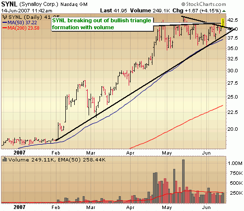
A few days ago in a post titled “The Failure of a Triangle”, I looked at the failure of a well formed triangle pattern as the market continued to slump. It’s important to point at that while these particular patterns often work, they, like all patterns, are never gauranteed. Today I thought I’d take a look at another triangle pattern that did successfully breakout. The company is SFBC Intl, Inc. and it broke through the upper portion of the triangle with good buying volume. Notice the declining volume as the triangle forms and then the explosion in price and volume on the breakout. (click the image for a larger view)

What you see here is that the triangle formation is actually a handle formation for a much larger cup base. I think it’s important to note that the cup base is not a well formed base. You like to see a smoother base with less volatilility and more time spent forming the right side of the cup. While today’s move was a good one, it may have trouble getting above 40 in the near term due to market weakness and the magnitude of the advance in such a short time.

Please note this is not a recommendation to buy or sell.. always do your own research before making a decision. Have a comment about this or other posts? I’d love to hear it.. have a good weekend!

The Failure of a Triangle

This is the first in what will be a series of posts highlighting stocks that have failed from bullish patterns and will be categorized under “When Good Charts Go Bad”. It’s important to study the chart patterns that fail so that we can avoid purchasing the stock or get out before getting burned. Today’s look is at a bullish symmetrical triangle formation that formed after a successful breakout from a flat base several weeks earlier. Often cited as a continuation pattern, the triangle formation presents a brief pause after a significant run up, before breaking out to additional gains. (as always, click the image below for a larger view)

In this particular case, Team Inc. caught my attention as a well formed triangle formation and I watched it closely for a break above the upper portion of the triangle with heavy volume. It never happened. Eventually, the stock broke below the support level of the lower portion of the triangle with heavy selling volume. However, no loss occurred because no buy signal was presented. This is a great example of why it is important to look for a breakout above resistance with large buying volume. Without the wind at your back, your chances at success will diminish significantly.