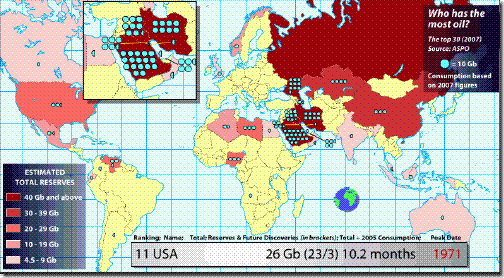
In doing some research for an oil trade article, I came across a darn good map of world oil reserves that’s based in flash and interactive so you can see which countries have the most in reserve and which are the largest consumers. No surprise in terms of consumption – the US and China are runaway leaders here. However, I was surprised that India wasn’t a bigger consumer of oil..but then again, they haven’t really reached the industrialized stage that China has, but when they do… perhaps at some point down the road $200 oil isn’t so far fetched. The most glaring thing that stands out to me though is the potential dominance that Russia may play in the oil game. They are undoubtedly sitting on billions upon billions of gallons of oil which is why I really like that Market Vectors Russia ETF (RSX) for the long haul. In the shorter term though, I actually like oil as a short and will highlight a couple ways to trade it tomorrow.
Check Out Our New Oil ETF Portal
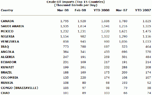
We import the most from Canada. Notice the increase in imports from Iraq and the decrease from Venezuela.. not too surprising.
Resource: Energy Information Administration


Hi Tate,
Nice map there thank you for posting that. Maybe I am reading it wrong or just have my facts mixed up but from this map it looks like the United States has more oil than Canada?
As I understand it the country that the US relies most upon for imported oil is Canada, so I always assumed that they had more oil than the US. Is this not correct?
Thanks
Dave
Hi Dave, good point.. perhaps they aren’t including much of the oil sands, hard to say. The map is based on data from the ASPO, the Association for the Study of Peak Oil
http://www.peakoil.net/ if you want to research it further. Unfortunately, I don’t have the time right now.
They aren’t. It says on the front page of that site, “Note: the map only indicates conventional oil because, with unconventional oils, the production rate is more important than the reserves (see Unconventional Oils) [explanation link: http://wolf.readinglitho.co.uk/subpages/uncoils.html%5D. It is misleading to directly compare a conventional oilfield in Saudi Arabia, for instance, with the tar sands fields in Canada.”
The page on unconventional oils basically says that the shale and sand oil reserves of Canada and the US are so awkward and inefficient to turn into synthetic crude oil that they’re never going to make much of a contribution.
Another map which includes those reserves though: http://www.independent.co.uk/multimedia/archive/00031/World-Oil_31948a.jpg.
Radically different figures, especially for Canada, but also for the US; it shows less for Russia than the one linked above. Personally given the explanation about unconventional oils I prefer the above map; although the one I just linked did come from an article which argues that the OPEC countries are deliberately underestimating their reserves (by about half!) to push the price up.
Thanks for your import Tom.. I have read many articles that say that OPEC countries greatly exaggerate the amount of oil they have to maintain their standing in the world. .. I suppose the argument could be made for them wanting to underestimate in the short term to drive prices higher but eventually the supply demand balance will shift..
Hello there,prediction of 200$ a barrel has dashed down,it appears that before the selection of new american president there is a trend to diffuse the oil wealth the many countries which are not alleys of usa,have been gathering recently.But isnt it so that if oil price is high it is again usa which benefits the most.just would like your view,thanks.